- Keke Rosberg
- Nigel Mansell
- Jenson Button
- Nico Rosberg
- Gilles Villeneuve
- Mika Hakkinen
- Jackie Stewart
- Mika Salo
- Emerson Fittipaldi
- Charles Leclerc
- Lewis Hamilton
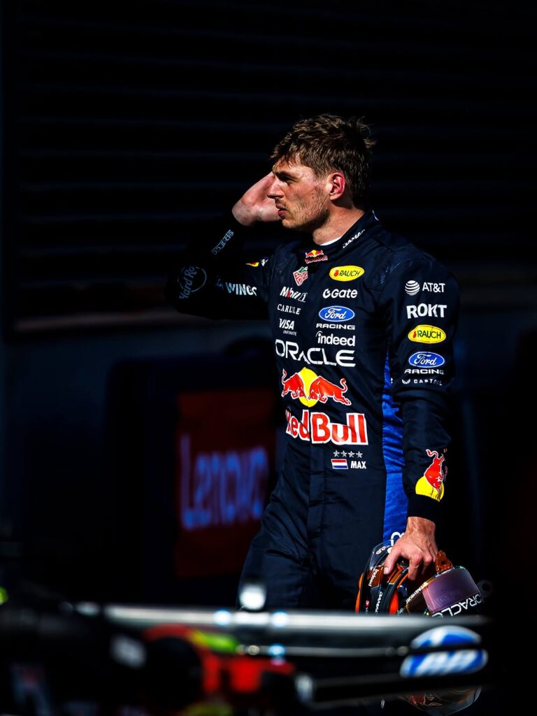
- Max Verstappen
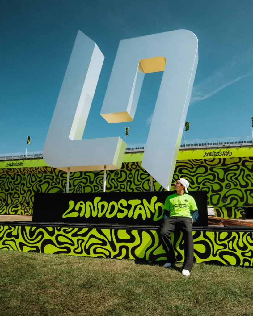
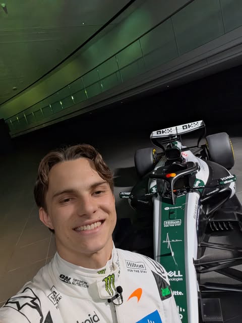
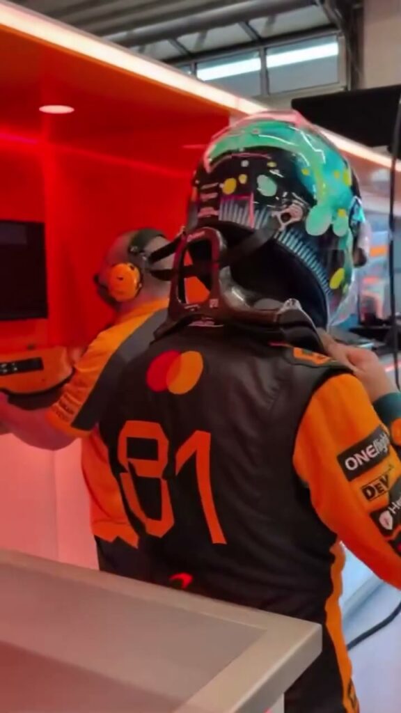
- Lando Norris
- Ayrton Senna
- Michael Schumacher
- Fernando Alonso
- Oscar Piastri
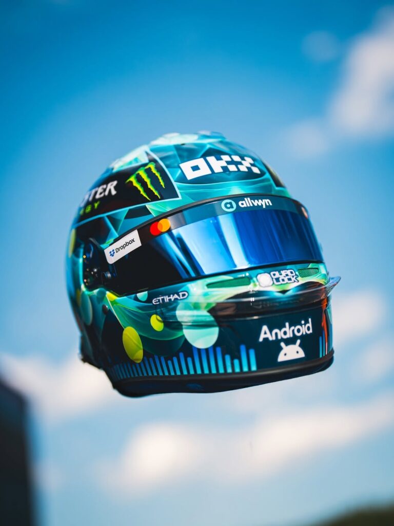
- George Russell
- Kimi Antonelli
- Nico Hülkenberg
- Gabriel Bortoleto
- Pierre Gasly
- Franco Colapinto
- Carlos Sainz
- Oliver Bearman
- Sergio Pérez
- Valtteri Bottas
- Isack Hadjar
- Alain Prost
- James Hunt
Toto Wolff Keeps Mercedes Grounded as McLaren Eyes Canadian GP Upgrades: A Design Reveal Perspective
Posted by
 123Helmets Editorial Team
DESIGN REVEAL
Toto Wolff Keeps Mercedes Grounded as McLaren Eyes Canadian GP Upgrades: A Design Reveal Perspective
While Toto Wolff publicly tempers expectations at Mercedes ahead of Montréal, McLaren’s papaya machinery and helmet liveries continue to define the visual identity of the 2024 grid. For collectors, this contrast between cautious rhetoric and bold design language makes the current era one of the most fascinating to document on a shelf.
Key Takeaways
Toto Wolff’s grounded stance ahead of Canada highlights how psychological framing now shapes paddock narratives as much as on-track design.
McLaren’s papaya identity has matured into one of the most coherent visual systems on the grid, ideal for full-size 1:1 display replicas.
Helmet liveries from Norris and Piastri offer two distinct collector profiles — vibrant pop versus minimalist precision.
Mid-season upgrade cycles, like the one expected in Montréal, often coincide with subtle helmet refreshes worth tracking as a collector.
Wolff’s Tempered Tone and What It Means for the Visual Narrative
Toto Wolff has spent the build-up to the Canadian Grand Prix doing what he does best in difficult seasons: lowering the temperature. The Mercedes team principal has been candid about the Silver Arrows’ inconsistency, openly admitting that the W15 still hides answers the team has not fully unlocked. His message ahead of Montréal — measured, almost stoic — stands in sharp contrast to the visual confidence radiating from McLaren’s garage.
That contrast is, for a design observer, the real story of this stretch of the calendar. When a championship-contending team like Mercedes is managing expectations through language, rival outfits seize the narrative through imagery. And right now, no team is winning the imagery battle as decisively as McLaren.
Why Rhetoric Matters to Design Watchers
Press conferences shape the lens through which fans interpret liveries, helmets and on-car branding. Wolff’s grounded tone signals a transitional phase for Mercedes, while McLaren’s bullishness — both spoken and visual — reinforces the perception of momentum. For collectors building a 2024 display, that perception is decisive: the helmets you choose today become the visual shorthand for this season’s story tomorrow.
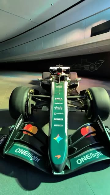
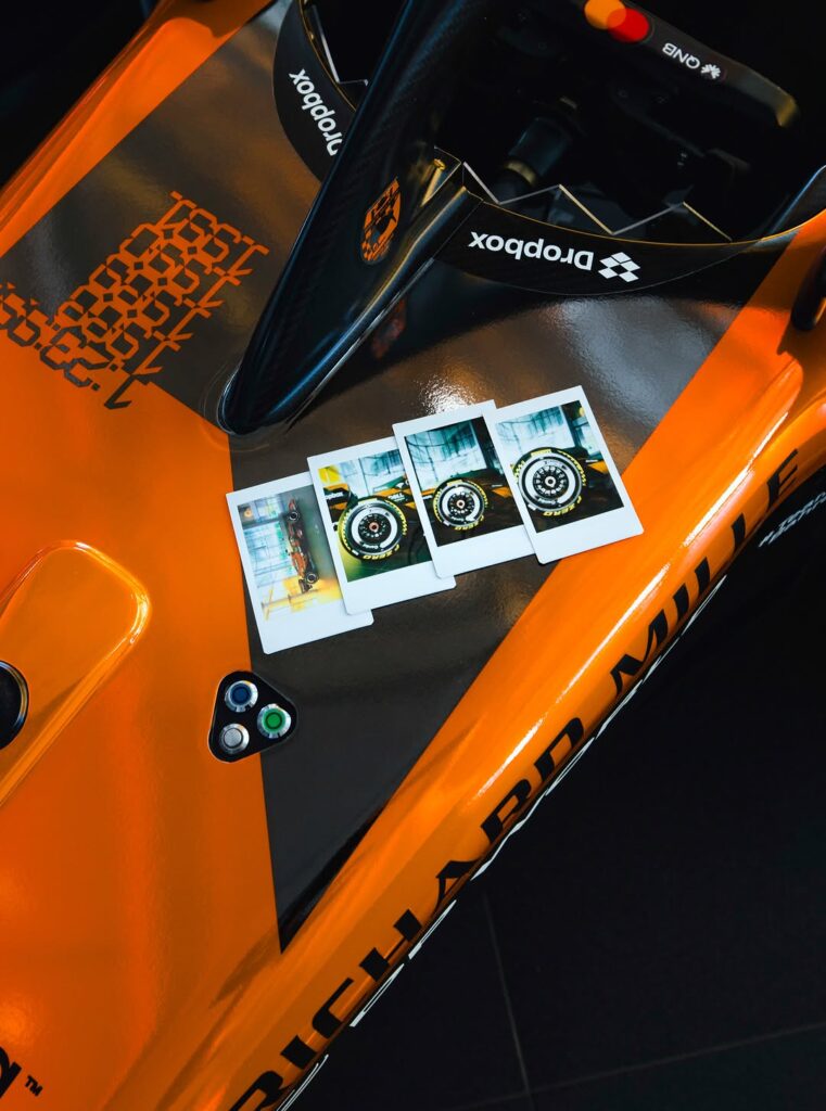
McLaren’s Papaya Identity: A Designer’s Breakdown
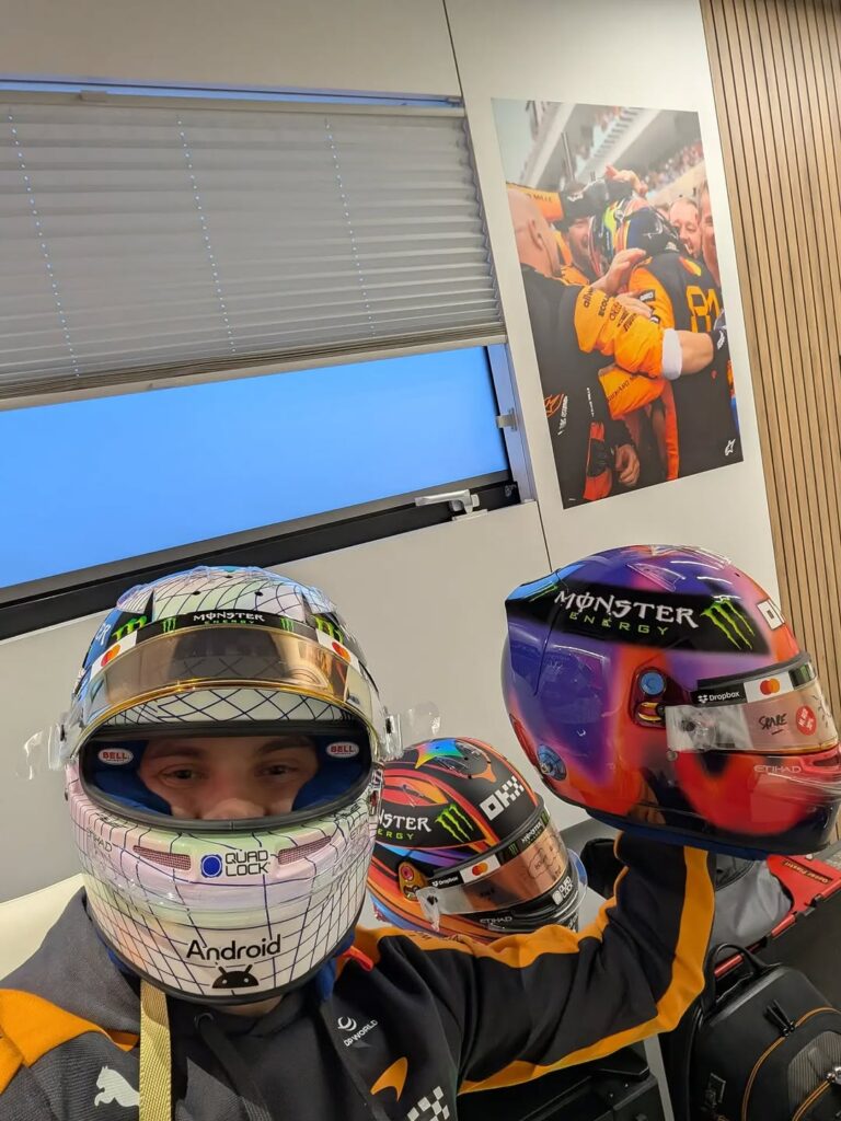
McLaren’s current visual language is the result of years of careful iteration. The papaya is no longer a single shade but a calibrated gradient system, paired with deep anthracite and accents of electric blue. On Lando Norris’s and Oscar Piastri’s helmets, that system translates into two strikingly different interpretations of the same brand DNA.
Colour Theory in the Papaya Era
The papaya orange used by McLaren sits in a narrow band between safety orange and a softer coral. Under Montréal’s typically variable light — overcast mornings, harsh afternoon sun bouncing off the Circuit Gilles-Villeneuve walls — that hue reads with extraordinary clarity. It is, in design terms, a high-legibility colour, which is why it photographs so consistently across broadcast, on-board cameras and trackside lenses.
Typography and Sponsor Integration
What separates McLaren’s 2024 presentation from earlier eras is the discipline of its typography. Sponsor logos are arranged with breathing room, the team script flows along curves rather than fighting them, and the helmet decals respect the natural geometry of the shell. For a full-size 1:1 collector replica, this discipline is gold: every angle on the display stand reveals considered design rather than cluttered branding.
Norris vs Piastri: Two Helmets, Two Collector Profiles
If you are curating a McLaren-focused shelf, the two current drivers present complementary rather than competing options. Each helmet tells a different story about the modern McLaren project.
Lando Norris: Vibrant Pop and Personality
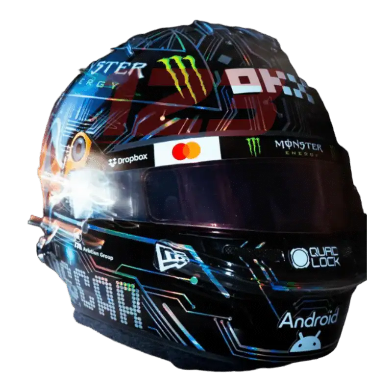
Norris’s helmet has long embraced bold colour blocking, playful iconography and pop-culture references. The latest evolution retains his signature neon accents while leaning further into the papaya base, creating a piece that almost glows under display lighting. It is the helmet of a driver who has matured into a race winner without losing his identity — and as a 1:1 exhibition replica, it commands attention from across a room.
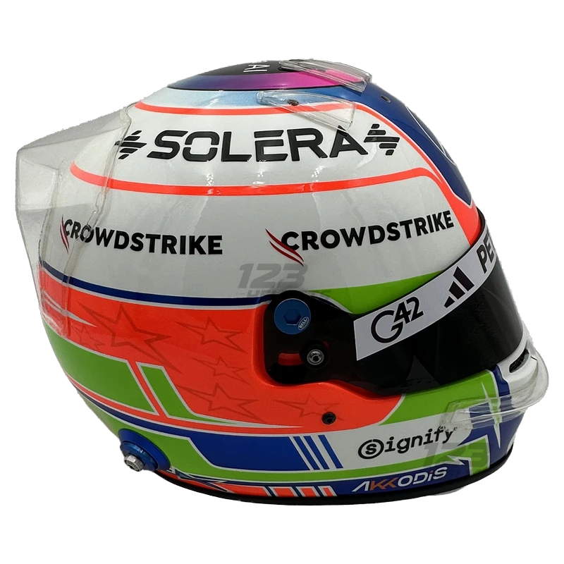
Oscar Piastri: Minimalist Precision
Piastri’s design philosophy is the opposite: restrained, geometric, almost architectural. Blocks of papaya meet clean diagonals, with subtle Australian references that reward close inspection. On a display stand, Piastri’s helmet rewards proximity — it is a collector piece built to be examined, not just admired from afar. Together, the two helmets create a balanced visual conversation that no single-driver display can match.
Canadian GP Upgrade Cycles and Why Collectors Should Watch
Montréal has historically been a flashpoint on the calendar for mid-season upgrade packages. Teams arrive with revised floors, refined sidepods and, occasionally, fresh helmet liveries timed to coincide with the European-bound momentum that follows. McLaren has used these inflection points before to introduce subtle livery refreshes — a new sponsor decal here, a tweaked accent stripe there.
Tracking Visual Evolution
For collectors, these mid-season tweaks matter. A helmet replica that captures a specific version of a livery — pre-Canada versus post-Canada, for example — becomes a documented snapshot of the season’s narrative arc. The full-size 1:1 format is particularly suited to this kind of curation because the scale preserves every micro-detail of decal placement, gradient transition and finish texture.
The Wolff Effect on Rival Branding
When a team principal as influential as Wolff publicly manages expectations, rival marketing departments respond. Expect McLaren’s visual presentation in Canada to lean into confidence: cleaner photography, sharper trackside backdrops, and helmet reveals timed for maximum contrast against the Mercedes narrative of caution. This is the modern Formula 1 ecosystem, where every press conference shapes every design decision.
Display Strategy: Building a 2024 McLaren Showcase
For collectors approaching a McLaren-themed display this season, a few principles elevate the result from impressive to museum-grade.
Lighting and Backdrop
Papaya responds beautifully to warm, directional lighting. A neutral grey or matte black backdrop allows the orange to project forward without competing reflections. Avoid pure white walls, which flatten the gradient and wash out the deeper tones in the helmet shell.
Pairing and Sequencing
If space allows, position Norris and Piastri replicas at slightly different heights, mirroring the asymmetry of a paddock garage. Add a single supporting piece — perhaps a team-branded plinth or a framed circuit map of Montréal — to anchor the era without overcrowding the focal helmets.
Why 1:1 Scale Matters
Smaller-scale models can never capture the architectural presence of a real helmet shell. The full-size 1:1 replica is the only format where decal proportions, visor curvature and aero element placement read correctly to the eye. For a serious collector, this scale is not a luxury — it is the baseline for exhibition-quality display.
The Bigger Picture: Design as Championship Narrative
Wolff’s grounded tone ahead of Canada is, ultimately, an admission that championships are now contested on multiple fronts. On track, in the wind tunnel, and — increasingly — in the visual language each team projects to a global audience. McLaren’s 2024 design system is one of the most accomplished in recent memory, and the helmets worn by Norris and Piastri are the most accessible entry points into that system for collectors.
Whether the Canadian GP delivers a McLaren breakthrough or a Mercedes resurgence, the helmets being raced this weekend will be remembered as the visual signature of this chapter. Acting now, while the season’s narrative is still being written, is the collector’s true advantage.
“The papaya era has matured into something genuinely architectural — every curve, every decal, every gradient now reads with intention.”
— 123Helmets Design Desk
FAQ
Q: Why is McLaren’s papaya colour so important to the team’s visual identity?
Papaya is McLaren’s heritage colour, dating back to the team’s earliest racing years. The modern interpretation has been refined into a calibrated gradient system that photographs consistently across all lighting conditions, making it one of the most recognisable hues on the current grid.
Q: How do Norris and Piastri’s helmet designs differ?
Norris favours vibrant colour blocking, neon accents and playful iconography, while Piastri leans into minimalist geometry and restrained composition. Together they offer collectors two complementary interpretations of the same McLaren brand language.
Q: Why does the Canadian GP often coincide with design refreshes?
Montréal sits at a natural inflection point in the calendar, with teams arriving fresh from European testing windows and approaching the heart of the season. Upgrade packages and subtle livery refreshes are frequently timed to this race for maximum visibility.
Q: What makes a full-size 1:1 replica ideal for display?
The full-size format preserves every detail of decal placement, gradient transitions, visor curvature and finish texture. Smaller scales cannot reproduce the architectural presence of a real helmet shell, which is essential for exhibition-quality collector displays.
Q: Are these helmets suitable for protective use?
No. These are display and collector replicas only, intended exclusively as full-size 1:1 exhibition pieces. They are not designed, tested or certified for any protective application.
Shop McLaren Helmets
Display and collector replicas only. Not certified for protective use. Full-size 1:1 scale.